Cyclist
The 21 best pro cycling jerseys of the 2020s so far
Cycling might not have a reputation as one of sport’s most stylish pursuits. That said, over the past four years, cycling jerseys have improved in design and have become centrepiece collector’s items. Heck, people are now wearing cycling jerseys to get into the famed techno club Berghain and thrift shops are filled with overpriced jerseys from the WorldTour new and old.
Today, we’ll be dissecting the recent waft of jerseys on offer in pro cycling since the turn of the decade. Our selection will be made based on looks alone, there’s no need to factor in the jersey’s significance or poignance. Sorry, UAE Team Emirates, you’ll be on the sidelines here. To keep this ranking balanced, teams will be allowed one entry for their regular kit as well as one special inclusion for limited edition jerseys such as Tour de France exclusives. National, continental and world champions kits will also be off the table. I’m not going to open Pandora’s box and rank national flags – although Maximilian Schachmann’s German champion’s jersey from 2020 would 100% make the cut.
This might be the most subjective list in this mid-decade ranking series. So, feel free to let us know in the comments and on social media which jerseys you’ll fight tooth and nail for. Anyways, let’s crack on and share our top 21 pro jerseys of the 2020s so far.
21. Trek-Segafredo (2023)

Only used for half of the 2023 season before the American team’s high-profile deal with German budget supermarket Lidl, Trek-Segafredo‘s short-lived 2023 jersey is a real standout from last year’s UCI WorldTour.
Negative space is used well on the front side of the jersey. The sponsor logos are well-placed and don’t interrupt the classic design. Plus, the red lettering from the Segafredo logo connects back to the main red theme that runs through the whole kit.
A grand QR-code-style block design was laid on the rear side of the jersey. This helped the outfit stand out on aerial shots, differing from the bombardment of red designs within the men’s peloton last year.
The men’s and women’s teams used the same design but went with two different core colours: blue for women and red for men. The red, for me, stands out a little more. Along with the yellow dashes from the team’s Pirelli sponsorship, the red looks a little more complimentary than the women’s blue alternative.
20. Jumbo-Visma ‘The Masterpiece’ (2022)

I’ve heard this described as ‘the vomit jersey’. However, I’m here to break the stigma attached to this rather unique Jumbo-Visma kit.
Forced to change their colours to avoid a clash with the Tour’s maillot jaune, Jumbo-Visma unveiled their ambitious ‘Masterpiece’ jersey well ahead of the 2022 Tour de France. Back when AI wasn’t seen as evil, the Dutch superteam enlisted the help of computerised intelligence to create a jersey forged out of some seminal Dutch paintings, notably from the Dutch Golden Era. The artists referenced in the jersey include Rembrandt, Van Gogh and Vermeer.
The final product is a unique jersey characterised by a caramel-coloured hue. Paired with the yellow logo of Dutch supermarket Jumbo and the red splashes on the Visma logo, the jersey comes to life.
The textures with clear references to the brush strokes and painting styles of the likes of Rembrandt and Van Gogh. Look closely at the bottom left-hand side of the jersey and you can spot some obvious references to Van Gogh.
The intent of the jersey was cool. How many times do we get fine art referenced in professional cycling?
19. Trinity Racing (2024)

British development team Trinity Racing have been switching up their jersey year-on-year since their big breakthrough in 2020. None of the kits were duds as well, all would be worthy of making this list.
Their 2024 jersey is built around a chaotic checkerboard design which fails to follow even the standard conventions of that motif. The negative space in the checkerboard is completely ignored to create an incongruent mix of royal blue, chartreuse green and off-white throughout the jersey. To me, it looks quite similar to a TV test card.
The Specialized logo is played with to create a video-game-like aesthetic whilst the team’s own name is overlayed with an italic outline of the team presented in a disruptive pink hue. This pink is continued onto the back of the jersey which features a hard-to-miss letter ‘T’, a nod to the team’s name.
It’s undeniably cool, at least for pro cycling design standards. It reflects the playful young nature of the team and its unorthodox approach as a development team in the current pro cycling outlook.
18. Astana Qazaqstan’s marble effect jersey (2023)

Astana rarely switch up their jersey. They’ve honoured a mixture of Kazakh baby blue and yellow since the team’s inception during the 2000s. Therefore, it’s quite the leap for them to make it onto a list like this.
The kit was switched up for the 2023 Tour – the supposed last dance of Mark Cavendish – and the Kazakh squad unveiled this challenging take on their staple design. The jersey is set over a maximalist marble effect that cracks up the traditional baby blue with splashes of yellow and dark navy. Some might say marble, some might call this the weather map or mouldy jersey.
To me though, it looks good. It stands out and held a unique place amongst the muted designs on offer at the 2023 Tour. They successfully rescued a rather drab kit and made it into a beauty. Mwah.
The jersey was so popular that it was carried over to the Vuelta a España and the marble effect was employed for the team’s 2024 kit which was, of course, worn by Mark Cavendish during his 35th stage victory in Saint-Vulbas earlier this year.
17. Unibet-Tour de Tietma (2024)
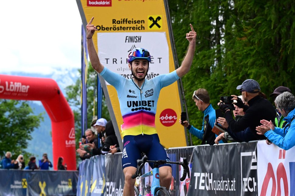
One of the most exciting teams in the current pro scene, the Unibet-Tour de Tietema squad have overcome their maverick status to become a serious team with a likeable modus operandi.
Headed up by YouTuber and former rider Bas Tietema, the team have released two stellar kits within their short two-season existence to date. The squad’s 2024 kit is very playful. A mild turquoise is counteracted at the bottom half of the jersey by bright purple, pink and yellow tones, bringing that fiesta feel to the outfit. The jersey instantly stands out with its bright colour palette, but in the peloton, it’s not distracting as the lighter tones occupy most of the TV shot when the riders are crouched over the handlebars.
The monochrome logotypes are a smart choice used effectively. The logos don’t take away from the fun factor of the jersey and don’t detract from the playful nature of the kit. In short, the logos don’t try to interject some corporate colours and messaging onto the team’s organic feel.
When paired up with the vibrant paint job on the squad’s Cannondale frames, Tour de Tietema will surely leave their mark later into the 2020s. The squad has the grand ambition of making it into the Tour de France one day. If we get a jersey like this on a Tour startline, I’m in.
16. Intermarché-Wanty’s elusive 50th anniversary kit (July 2024)

This lesser-known Intermarché-Wanty kit was never seen on the roads at the WorldTour level in 2024. In a collaboration with Restos du Cœur, this yellow kit was only used during rest day rides at the 2024 Tour. Sadly, this special edition kit was snubbed in favour of the squad’s standard jersey at this year’s Grand Boucle – perhaps due to the copious amount of yellow employed in its design.
This yellow-based jersey was released to celebrate the 50th anniversary of VC Ath, the original club behind the modern-day Intermarché squad. Using the colours and base design of that 1970s club kit, Biniam Girmay’s team presented a well-balanced training kit that honours the historical ties but also incorporates the new-world sponsors the team needs to cater for.
It reminds me of Union Saint-Gilloise, Brussels’ working-class football club in the top-tier of Belgian football, which uses similar hues.
The charity partnership with Restos du Cœur is also notable. The organisation sends out food packages to people in need, namely the homeless, in France. A worthy charity partnership alongside a historic ode to Intermarché-Wanty’s forgotten origins, it’s a shame we’ll never see this kit again.
15. Alpecin-Deceuninck (2024)

Pioneers of the Canadian tuxedo revival, Alpecin-Deceuninck’s 2024 kit was met with some raised eyebrows at the team’s delayed kit launch at the beginning of the 2024 season. The Belgian team’s 2024 jersey might not be for everyone, but it certainly caught my eye.
The denim effect is an interesting play on a staple of Western fashion. It’s a playful take on the boring selection of blue jerseys that appeared at the head of the 2024 season. Paired with the denim effect shorts, the double denim outfit became one of the headline jersey releases on the UCI WorldTour, and for good reason.
The blue, white and red colour combination is classic. Plus, the placement of the Canyon logo on the hems looks clean, as do the subtle yet plentiful array of sponsor logos that have been scattered around the jersey with little visual noise.
14. Pingtan International Tourism Island Cycling Team (2023)

OK, this is the only real deep cut on this list, but let me justify its inclusion.
I doubt that many of you are familiar with the Pingtan International Tourism Island Cycling Team. I’ll be honest, I couldn’t name any of their riders. However, their kit lives on in my memory as one of the finest kits of last year. I mean, which other team has a whale on their jersey?
The little-known Chinese team failed to record a pro win in 2023 according to the cycling database Procyclingstats, however, their impact on me is far deeper than their results. The 2023 jersey is a beautiful melange of whites and blues as the jersey honours, what I can only assume to be, the island’s maritime locale.
The main draw of this jersey are two whales that can be spotted. The two mammals are seen on both the front and rear of the jersey swimming around an oriental-inspired wave design. This dreamy design is let down by the terrible typeface used in the sponsor’s English-language logotype. We can’t all be perfect, OK?
Overall, the jersey really does convey a clear story – as poncy as that sounds. Looking at it, I know exactly what they’re trying to promote. You might see me out on Pingtan Island soon. There’s a natural blue glow in some parts of its waters caused by plankton bloom. I’m sold.
13. Eolo-Kometa (2022)
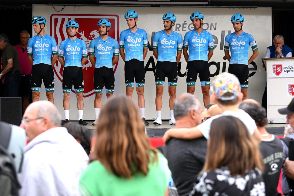
One of the more slept-on teams in the Italian contingent, Eolo-Kometa’s jerseys from the early 2020s were among some of the neatest about.
The sky blue used for the main body of the jersey isn’t exactly earth-shattering, but it’s clean. Softened by some tame stripes through the jersey, the kit has some intrigue without the need for any garish patterns or colour gimmicks. Bordered by dark green panels on the sleeves and shorts, the colours work well together despite their potentially simplistic appearance.
To add, the sponsor logos have been worked in well. The Eolo logo is inoffensive and works quite well when put on full blast on a jersey like this. The small ‘E’ condensed version of the logo scattered throughout the jersey also works well and remains memorable among a sea of forgettable sponsors. Did I mention the small Burger King logo printed on the back of the shorts? No, that’s not satire.
It’s just a shame that this kit was swapped out for a monstrosity in 2024 when Polti became the title sponsor of the team. Then, the jersey was swapped out for a white, green and orange jersey with pumpkin-coloured shorts. Yikes.
12. Q36.5 (2023)

Did you know that 36.5°C is the ideal body temperature for athletic performance?
In their debut season, Q36.5, the phoenix team led by former Dimension Data boss Doug Ryder, jumped onto the ProTeam scene with a bold choice of jersey.
Unconventional in its design, the TV static-style jersey stood out thanks to its strange yet appealing approach. The scattered yellow circles provide a chaotic visual, but one that looks as scientific as the team’s name. Maybe it’s because I’ve become a little too interested in the body temperature tagline, but the jersey’s seemingly non-sensical dashing of black and yellow spots looks almost like a heat map.
Paired with the selection of blue-chip sponsors ladened across the shirt, this jersey stands out despite its grey colour palette. I wouldn’t be too upset to see Tom Pidcock in some variant of this kit in the seasons to come.
11. Team Corratec (2023)

I realise that I have my work cut out to defend this lesser-known Italian kit’s inclusion on this list.
Corratec’s 2023 jersey somewhat leans into the maximalist style conventions employed by the buffet of Italian second-tier teams fighting for Giro d’Italia invites. It has an unorthodox colour palette and a wide selection of sponsor logos to balance out. It even boasts enough text to surpass a university thesis word count. This is cycling heritage. It shouldn’t work on paper, but Corratec’s 2023 jersey manages to pull it all off.
Burgandy is an underused shade in cycling fashion. Paired with the yellow and deeper navy, this jersey really stands out to me (and possibly no one else). The stripes through the centre of the jersey and hem of the shorts also give this jersey a unique but stylish visual identity and it doesn’t come off as an attempt to appease 20 different boardrooms.
10. Team Sunweb (2020)

Perhaps I’m leaning into the rose-tinted memories of Team Sunweb’s Indian Summer – or well, Indian autumn given the calendar reshuffle in 2020. However, this rework of their original 2020 jersey is a well-balanced classic of the early 2020s peloton.
Swapping out the red they used for the interrupted early months of the 2020 programme, Team Sunweb launched an all-new kit for the remainder of the 2020 season. The kit is magpie-like with its simple yet effective black and white design. With clear-cut ‘Keep Challenging lines’ that have become customary on this squad’s kits since the past decade, the kit is well structured despite its abundance of white space. The monochrome design is offset well by the splutterings of red in the Sunweb logos and the red-branded Cervélo the team used during the 2020 season. I know this list is about jerseys, but the shorts also harbour a subtle white checkered pattern through the thigh panels. It’s classy, I’ll say that.
This was one of the more successful jerseys of the 2020 season. Sunweb finished in fourth place in the UCI Rankings that year and poached two Grand Tour podiums, three Tour stage wins and a major Classics title courtesy of breakthrough rider Marc Hirschi. Hopefully, Team DSM-Firmenich-PostNL can return to their simplistic style heritage in the seasons to come.
9. Lotto-Soudal (2021)

Clean, regimented and classic. These are my three takeaways from the 2021 variant of Lotto Soudal’s jersey.
The Belgian team’s 2021 offering was a timeless kit that ticks plenty of boxes. The black, white and red combination humours all the appropriate sponsor colours and it looks mightily clean and classy. The Soudal logo, which features a tricky little red rectangle, is placed in an appropriate position here (take notes Soudal-Quickstep), and the somewhat dated Lotto logo calmly slots in below without any fuss.
The Yuzzu logo splatters some yellow on the sleeves which, once again, adds a nice contrast to the three dominating colours on the jersey. Plus, the red Lotto logotype also adds another neat sponsor placement on the jersey’s side panels without distracting from the clean design.
However, my only gripe with this jersey is that the Soudal logo appears higher up than the Lotto one. Isn’t Lotto the primary sponsor here?
8. Alpecin-Deceuninck ‘Merci PouPou’ (2021)

Ahead of the 2021 Tour de France, Alpecin-Deceuninck launched a special edition kit in honour of French cycling royalty.
Inspired by the outfit used by the Mercier team, home of Mathieu van der Poel‘s grandfather Raymond Poulidor, Alpecin-Deceuninck reworked the iconic jersey into a modern classic. The purple and yellow is completely contrary to the team’s normal red and navy combo, but the Belgian squad made it work. To add to the history, the team also staged a photo shoot to emanate the spirit of Raymond Poulidor, notably with Van Der Poel sipping on a bottle of sparkling water just like his grandfather did in a similar photoshoot 50 years prior.
The jersey was only used in competition for the opening stage of the 2021 Tour, the team’s maiden stage at the French race. The squad still use the jerseys, however. You can spot Alpecin soigneurs at the side of the road wearing the Mercier-inspired fit. Once back into the team’s normal colours, they took two stage wins and the yellow jersey. Maybe the purple outfit was cursed after all.
Regardless, it’s become one of the most popular kits to emerge from the 2020s so far, and many fans await its comeback at some point soon.
7. FDJ-Suez (2024)

Just marvel at this. FDJ-Suez delivered one of the best kits of the 2024 season with their Gobik-designed jersey.
In keeping with the team’s national identity and sponsorship, blue, white and and red are unavoidable on this jersey. That’s understandable given that the team is backed by the French national lottery, Française des Jeux. The jersey designers have also packed in a heap of sponsor logos without distracting from the main centrepiece of the design, this asymmetric geometric pattern that stretches across the bulk of the jersey.
The subtle geometric design is masterfully done. It’s not shoe-horned in unlike some previous attempts in the pro peloton (sorry, Ineos of 2022 and 2023). The two different coloured sleeves are also a neat choice. This could perhaps reflect the layout of the French tricolour flag. Elsewhere, the transition into the shorts is similarly smooth, with a gradual fade from blue to black towards the lower third of the jersey.
I’ll be honest, I can’t wait to see Demi Vollering wearing some form of this masterpiece next year.
6. Lifeplus-Wahoo (2024)

Staying on the theme of asymmetry, we can notice a real shift away from the bland and muted designs of the early 2020s. Instead, designers moved towards a pathway of asymmetry and loud colours towards the midway point of the decade.
One key example of these trends can be found in Lifeplus-Wahoo’s marvellous 2024 kit. The Maap-designed jersey is hard to ignore in the bunch. The pairing of mint green and a soft grey purple is certainly unique to the British squad. Anchored by this almost northern lights-like mint-coloured wave, the jersey has a lot more stylistic bite to it than most in the pro peloton. It’s also a bit more daring which is good to see.
The design is given centre stage here. Even amongst the strange mint wave, the sponsor logos find a place to be nestled in comfortably, but they don’t distract from the captivating composition. Cigarette packet green isn’t the most fetching choice of shorts colour, but I’m willing to let that slide in the name of bold design.
That said, this eye-catching jersey won’t be seen in the women’s peloton next year. The British team has sadly closed its doors. Forever, they will be memorialised on this list.
5. EF’s Giro d’Italia Palace Collaboration (2020)

Forced to switch out the team’s now-iconic pink outfits, EF were sent to the drawing board ahead of the 2020 Giro d’Italia. In a surprising collaboration, Palace were soon announced to be working alongside the team and the final product was swiftly released to much media commentary.
The jersey is like Marmite – you either love it or hate it. It’s loud and disruptive. It’s decorated with white polka-dots, a psychedelic-style collage of portraits and a head-turning combination of pinks, purples and blues. Along with Palace’s iconic triangle logo, the kit – and the helmets for that matter – were adorned with ducks, a reference to the British brand’s mascot.
Regardless of what you think about it, the Palace collaboration transcended cycling. The kits sold out in a matter of a few hours and have now become collector’s items with cycling and streetwear enthusiasts alike. Even the merchandise released as part of this range sold like hotcakes. For a brief moment, a mere cycling jersey became one of the most talked about garments in sport.
If you have a jersey in a medium size, feel free to send me an email. I’ll happily take it off your hands.
4. B&B Hotels p/b KTM (2021)

A relic of the early 2020s, Breton squad B&B Hotels offered one of the most unique jerseys in the pro peloton. At the forefront of the design is the glaz motif. ‘What’s glaz?’, I hear you ask. This particular tone of blue is said to reflect the colour of the Breton sea. Core to the team’s local identity, the colour became synonymous with B&B Hotels during their short tenure as the title sponsor of Jérôme Pineau’s Brittany-centric squad.
Running with this, the colour was referenced in the team’s slogan ‘Men in Glaz’ which appears on the left breast of the jersey. As Franglais as it sounds, it’s memorable and was even the title of the team’s own anthem performed by well-known Breton rapper Manau, the artist behind the popular 2000s French party song La Tribu du Dana. Seriously, take a listen, it includes a bagpipe instrumental and cycling-inspired verses. On top of this, the team created glaz-coloured Covid masks and Breton flags.
Glaz aside, the jersey was peppered with abstract lines and stripes inspired by the Breton flag. The round B&B Hotels logo was hard to work with, but the jersey designers at Noret smashed it out of the park. The black, white and glaz combination is in equal parts eye-catching, stylish and locally poignant.
Sadly, we didn’t get too many of these glaz-coloured jerseys. The team eventually folded at the end of 2022 after the failed launch of the Paris Cycling Club project which was supposed to take over the team for the 2023 season. If you have some time on your hands, that’s a fascinating and strange tale to read up on. The team launch, which included supposed recruit Mark Cavendish, was cancelled on just a couple of days’ notice and the project was swept under the rug, never to be spoken about again. That said, counterfeit jersey makers ran with the idea and AliExpress started selling a counterfeit jersey for the ill-fated squad.
3. Bora-Hansgrohe (2022)

Bora-Hansgrohe riders have adorned some of my favourite kits of the 2020s so far. As a whole, the German team is one of the most stylish teams in the pro peloton in my opinion – the hastily made Red Bull kit included.
For the list, I opted for their 2022 uniform. The jersey came after a change in jersey provider at the beginning of the 2022 season, plus, a big change in team roster and ambitions. Overall, I think it demonstrates their most innovative and stylish design to date.
Regardless of the big identity shift at the German team that year, Bora-Hansgrohe’s emblematic aquamarine colour is respected well on this jersey. The unique hue is adorned throughout the jersey and is paired nicely with different shades of teal and black on the right-hand side of the jersey and shorts. The splashes of red also help to add some flare to the team’s visual identity. This also brings some stylistic continuity with the Ötztal logo which features on the sleeves and breast.
However, what I respect most about this kit is how it really pioneered this new trend of asymmetry in pro cycling design, ultimately reflecting wider trends in fashion and streetwear. This is evident here on the jersey and shorts, providing a disruptive yet visually appealing jersey design that feels more contemporary than its counterparts. This Bora jersey looks a little like the patchwork jackets you see all over Shoreditch and more significantly like the jerseys now on offer at cycling’s trendiest ateliers. A step in the right direction, I’ll say that.
2. Canyon-SRAM (2023)

In the women’s peloton, Canyon-SRAM are often the team with the most challenging jerseys. With a mismatch of patterns, swirls of pastel colours and glitchy-style graphics adorned across the Canyon-SRAM jersey, the designers aren’t afraid to play around with the design rulebook.
Any of the team’s efforts since 2022 could have made this list, but I’ve opted for their 2023 offering. That year, the German team opted for a strange diamond pattern on the sleeves, arrow graphics through the chest and faint coordinate points dotted around the jersey. It’s hard to explain, so just take a minute to have a real gander at the kit.
The designers must be given carte blanche each year because the emphasis is always placed on a visually arresting design rather than affixing sponsor logos in a garish and Frankenstein-like manner. What I also like about the 2023 kit is the clever positioning of the Canyon logo down the centre of the jersey near the zip. It’s a little different to normal, but it actually wouldn’t be too out of place on a non-pro jersey.
With the arrival of a new cryptocurrency sponsor next year, I fear the worst. Hopefully, the designers can dig their heels in and continue to make wild designs for the years to come.
1. EF Education-EasyPost (2024)

EF Education-EasyPost have made plenty of exceptional kits. We already spoke about their Palace collaboration, but all of the American team’s kit designs since the turn of the decade would have been fitting additions to this list. However, I have to choose between my babies and I’ve opted for their most recent release.
As is now customary for EF, pink makes a heavy appearance in their 2024 jersey – as it should. This is balanced out, however, by the inclusion of yellow accents throughout. This feels like a small allusion to the hallowed cycling colour without raining on the Tour de France’s yellow parade. The combination also reminds me of those little bags of banana and shrimp soft sweets.
The array of doodles and characters throughout the kit hark to the artistic stylings of New York artist Keith Haring as well as contemporary street fashion and skateboard culture. I personally love the little crocodile, a subtle reference to the team’s long-forgotten mascot Argyle the Crocodile. More than anything though, it reflects the team’s philosophy and fun character.
The national champions’ kits stemming from this template are also worth a mention. Sean Quinn’s American champion kit has a bit of a bathbomb look to it, but it’s a banger. Ben Healy’s Irish champion’s jersey from the first half of the 2024 calendar is another stunner. It sold out pretty soon into the season, a testament to the stylish design.
There’s not much more I can say, it’s just a very good-looking jersey.
The post The 21 best pro cycling jerseys of the 2020s so far appeared first on Cyclist.


